
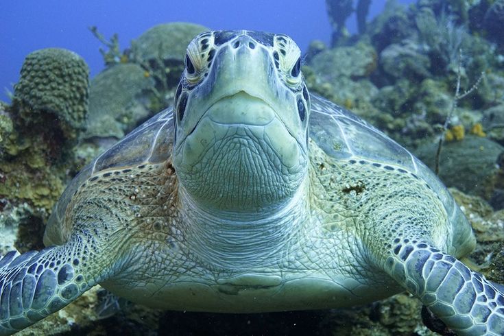
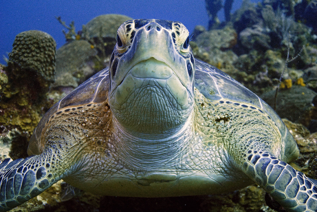
 The original image straight from the camera The original image straight from the camera - In our ORIGINAL jpg image (above) straight from the camera, we have a green sea turtle who is looking rather green. I don't think he has eaten a bad jellyfish, but rather, there is a bit of a green/cyan colour cast that is typical of underwater photography. Most photo editing software applications can handle this with ease. We do want to watch the colour of the water, and of the yellow sponges in the background as we adjust, to try and keep the colours true to life. So here it is, the colour corrections of this turtle from multiple photographers/editors. I love how we get to experience the different feeling and mood of the same image, depending on the photographer's interpretation. Not only that, but we get an introduction to the different types of colour correcting software available out there, and many may find that very useful! If you have questions about the software someone used, please go ahead and leave a question in the comments - we can forward your question, or the photographer can answer it right there! Enjoy! 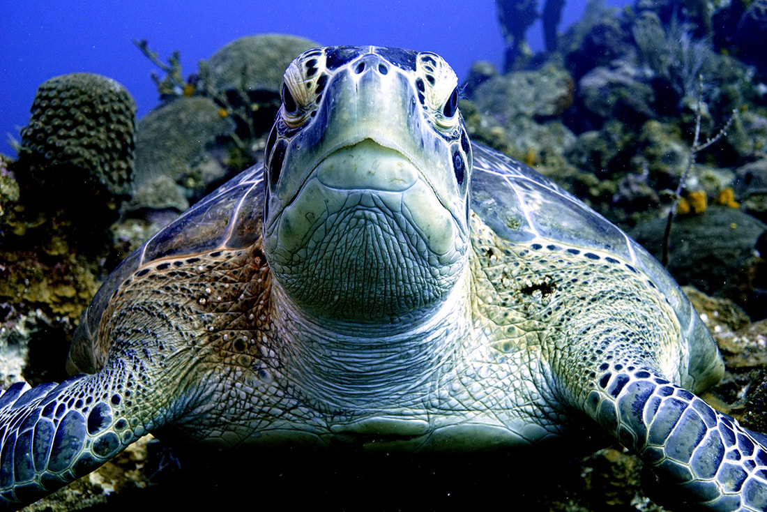 Alex S. - Vivid Pix - Changed the light balance, took some of the depth out of the picture adding some of the colours back into the picture creating a more vivid image. Software used: Vividpix The punchy detail looks amazing, and the water is still blue, and that is the pitfall in this type of image! Next to Alex's edit, the original looks incredibly flat! He's beauty, nice edit! 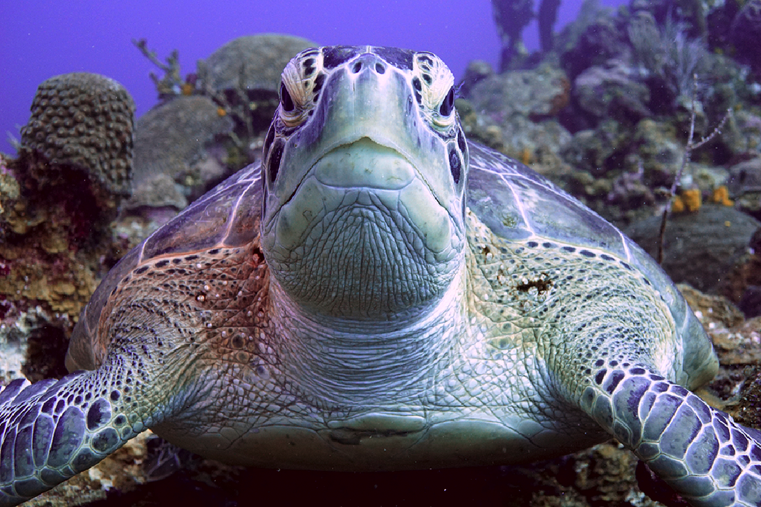 Dan P. - Gimp photo software - Removed the green colours and increased contrast. Software used: Gimp The contrast is better, and the green cast has been removed from the turtle, but this is the hard part: removing the green cast without turning the water pink! The complementary colour to green is magenta, so introducing it into the image does effectively knock out that green, but at the expense of turning the water magenta! If there are HSL sliders or selective colour functions in Gimp, that might be a place to target the blue/pink water separately, without turning the turtle green again. Good work! 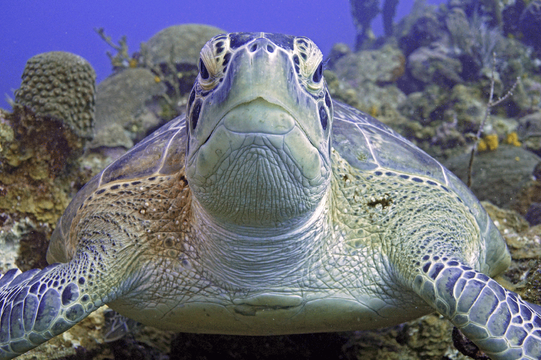 Mike M. - Adobe Photoshop - Worked from JPG. Mainly just adjusted the levels of each RGB channel and did some shadow/highlight changes. Software used: Adobe Photoshop I like the warmth of the colours in the turtle's shell and skin, very nice. The green cast has been addressed successfully, although there is a little bit of magenta creeping into the water behind the turtle. Selective colour (Image > adjustments > Selective Colour) can touch up the blue a bit, or the Hue Saturation box can be used to just target the blues. Looks great - nice edit! 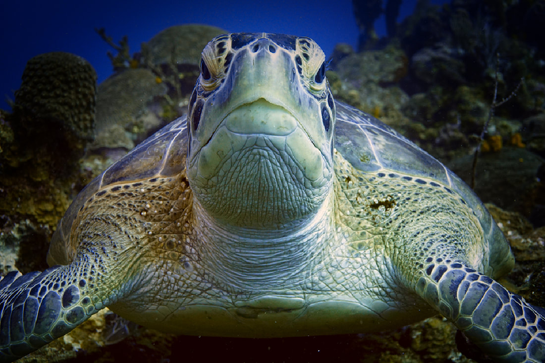 Emma F - ACDsee - used reds and yellows for turtle and layers to create a soft dark frame. Software used: ACDSee Well, the green cast is gone, and though at first glance it seems rather dark, I find it interesting. Nice work! 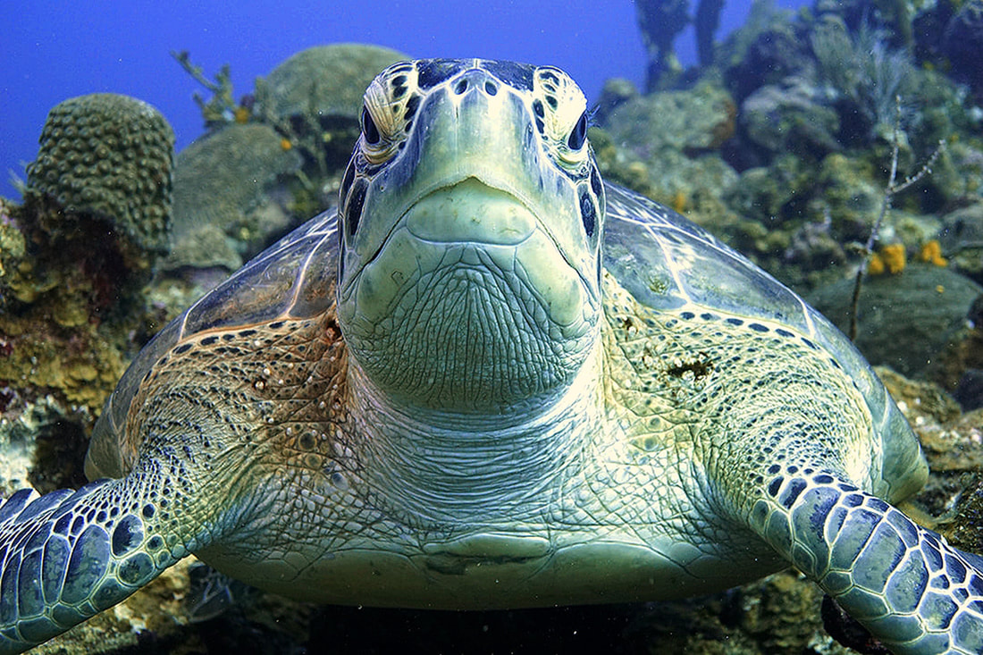 Ian G. - Latest Paint Shop Pro - From the .jpg, I added 9% red, took out 9% green and 15% blue, gamma corrected to -0.80, added 20% saturation, and added a bit of a sharpness filter. Software used: ACDsee from RAW file I like the warmth of the turtle, though there seems to be a bit of grain introduced (creative effect)? The warm detail has been preserved on the right side of his face (his left) over the eye, where it tends to get lost very quickly in editing. Nice work! 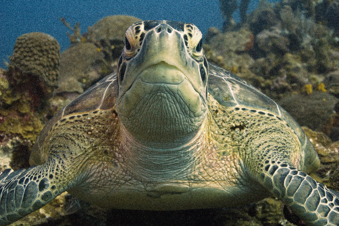 Rick B - ACDsee Pro - Turtle 2.3 - Clearly I have too much time on my hands (lol, Rick) So in total: white balance, dehaze, sharpen, colour adjust shoulder areas, reduced overall blues/violet/mauves, removed speckling below and beside turtle and removed the random twig from right side (of picture) behind turtle Software used: ACDsee from RAW file I like the warmth of the turtle, though there seems to be a bit of grain introduced (creative effect)? The warm detail has been preserved on the right side of his face (his left) over the eye, where it tends to get lost very quickly in editing. Nice work! It's fascinating how different every one of these corrected images look, and I have always found that I learned a lot from these exercises in class, noting the techniques I wanted to employ next time, and pitfalls I knew I needed to avoid in order to achieve what I wanted. Colours, vignettes, detail, and saturation variations can all contribute to mood, so when you have many editors working on the same file, you never know what you are going to get. Thank-you to everyone who participated in our experiment. If you are interested in trying another one, drop us a comment below!
1 Comment
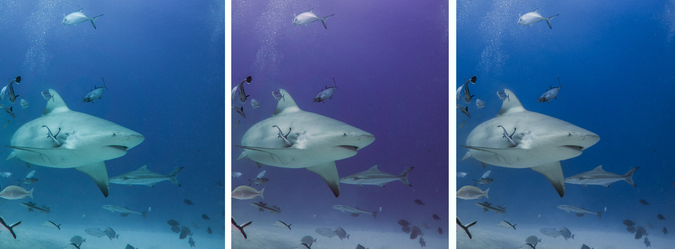 Correct globally for shark, and water becomes too magenta. Hue sliders allow for adjusting colours separately For my friends who are using Lightroom or ACDsee image processing software, you can adjust targeted colours using the Hue, Saturation and Luminance sliders! It helps to understand colour, so if you were not interested in colour theory in art class back in your highschool days, here is a little cheat sheet. Your camera captures the colours Red, Green, and Blue, and your monitor displays colour by emitting light through Red, Green, and Blue phosphors. ALL the colours you see on screen are created by mixing these three colours in varying intensities. 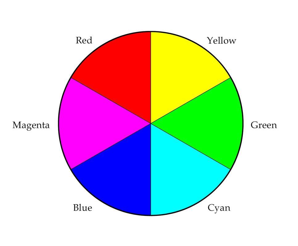 The colour wheel. The Colour Wheel Simply put, each colour on the wheel is created by mixing equal amounts of the colour on either side of it. For example, equal parts of Red light and Green light will result in YELLOW. Really! The colour directly opposite any colour on the wheel, represents its COMPLEMENTARY colour. If an image has a colour cast, you need to correctly identify the colour cast, and ADD its complimentary colour to neutralize it. 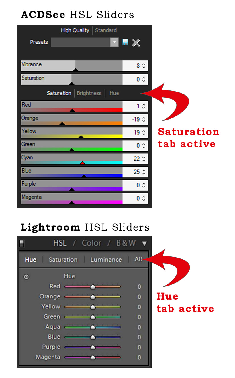 In the Lightroom slider panel, look to the left under the tab HUE. Click that double circle to click and drag colours directly on the photo. When we go diving, we notice significant colour loss in the scenery; Red, Orange, and Yellow light is filtered out of the water as we descend. This results in a very ugly colour cast that makes everything green or blue. If you have a colour cast of green (diving at the local lake), then you will want to adjust the white balance sliders by adding its complementary colour - Magenta. If the colour cast is Cyan, add Red. Sometimes colour correction of a subject or foreground results in undesirable colour in other parts of the photo, such as the shark picture at the top of this cheat sheet. The photo on the far left is direct from camera, the middle photo is the result of correcting colour for the shark (she was too green, so magenta/red was added), but this created a gross magenta colour cast in the water. It is so bad, that in the Hue slider, we adjust in the purple, sliding it to the left (toward blue), and blue to the left (toward cyan/green) to bring water back to blue. 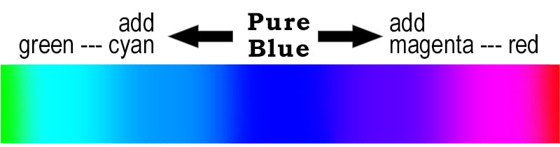 What colour is your water? The BLUE Hue Slider: Slide left for more green (becomes Cyan). Slide right for more red (becomes magenta). The Hue, Saturation and Luminance sliders can be found in a panel together in Lightroom, Adobe Camera Raw, and ACDsee Pro and Ultimate.
Hue This is where understanding your colour wheel comes into play. Change specific colours by moving sliders left or right. This means that the blue background of an underwater image can be made greener or pinker. Keep an eye on the other colours of the photo to make sure nothing is going awry. If another aspect of the photo is being detrimentally changed at the same time, then you may need to make a more specific target by using adjustment brushes to paint an effect on only an area of your choice (that's a cheat sheet for another day). Saturation Increase or decrease the brilliance of a specific colour in the photo. Luminance Darken or lighten a specific colour in the photo. Watch the effect particularly around edges to make sure weird halos aren't being created. Happy Sliding!  Channel Clinging Crab on a Sea Fan by Jill Smith First time with my new macro lens in Bahamas this November! For me, preparing for this “macro trip” meant reading article after article on tips for underwater macro photography. The images online are stunning, and these pros make it sound easy. Now that I have completed my first trip attempting to implement their tips and techniques, I assure you, it is not. It is my humble opinion that underwater macro photography is the MOST DIFFICULT kind of photography that exists (Perhaps others know better, but I am skeptical). It’s like trying to take a photo of erratically moving subjects at night in a snowstorm while you are floating and unstable; this is a photography challenge on steroids. My Equipment I have to admit, mine is not the ideal set up. I am using a 90mm macro lens with a Sony A6000 mirrorless camera with Nauticam housing, which is great, but I am using my macro lens with a dome port. Why? I was too lazy and cheap to order the port that goes with my macro lens, and thought I would experiment and decide for myself if I really do need the proper macro port. After a week of using it this way, I am now considering (but still undecided) the flat port for my macro lens for three reasons:
Above: A Yellow-line Arrow crab catches one of the bloodworms that is swarming my video light and eats a late dinner. The other equipment factor that affects my success, I think, is my lack of strobes. I am using two video lights mounted on arms, so I do have the ability to adjust lighting position, but it is next to impossible to sneak up on a fish with these bright lights shining in their eyes. Then again, I found them to be very beneficial on the night dives, when photographing coral banded shrimp, or yellowline arrow crabs, for example – they are attracted to the blood worms swimming around my video lights, and scramble out to catch them for dinner (win win!). The big advantage to having strobes versus video lights, is that if I set strobes for “through the lens” (TTL) metering, I can pre-set my aperture and shutter speed, allowing the strobes to adjust their output to accomplish proper exposure. There is an additional advantage to this, obviously, as constantly dialing in new f-stops and shutter speeds detracts from my reaction time to photo opportunities. 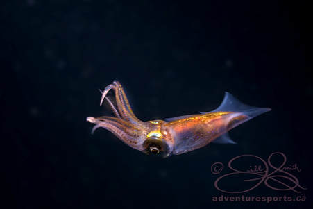 A Caribbean Reef Squid at night A Caribbean Reef Squid at night Settings Aperture - Ideally, though there are exceptions to the rule, my goal is to keep the aperture small, f8 to f22 at least, to give me the depth of field I need when I am very close to my subject (the trade-off is the diffraction distortion that occurs at high f-stops, but I will have to content myself with a post-processing sharpen to aid in minimizing this effect). My next priority is to keep the shutter speed fast – as fast as 1/200 or higher. This is desirable for two reasons: the first is that I want to freeze any movement to keep the subject sharp, and the second is to manipulate the background colour. The slower the shutter speed, the more ambient light is a factor in the background, often contributing to washed-out images with low contrast. A faster shutter speed results in your subject being illuminated primarily by your strobes or video light, rather than the ambient light, and further contrast is created as the background darkens to dark blue and even black, depending on just how fast the shutter speed is set. This is far easier to do with macro photography, as we are naturally close to our subject, and much more challenging with wide angle photography, as light falls off so quickly underwater with every foot of distance. Caribbean Reef Squid at night – this fella was interested in his reflection in my dome port, but I struggled to get him in sharp focus as he fluttered about. The image is flawed, as his eyes are out of focus, but the value for me is in the memory, as I loved meeting this fella. So I will just have to try again should the opportunity arise. Strobe/Light Placement I am still experimenting with placement of lights, but I generally try to keep them at the 10:00 and 2:00 position, closer to my lens than I would for wide angle photography. Sometimes this is difficult to maintain, as coral formations may obstruct lighting in some cases. I have learned to accept that sometimes you have to “swim” away from a subject in search of a more ideal subject and setting.  Getting closer to this large Southern Stingray Getting Close Everything I have read about underwater macro photography, advised, “Get close to your subject. When you think you are close enough, get closer…” This proved to be a helpful tip for me as I photographed the face of a large Southern stingray at close range. I knew I wanted to be close, and creeping in slowly, I took a shot before each “incremental creep”, in anticipation of subject desertion, but he was very cooperative. I took several shots, and as I started to turn back to join my buddy Annie, I remembered “the rule” of getting closer. So I turned back to the ray, and really got closer for a couple more shots. Interestingly enough, the last shot I took of his face is the shot I love the best! 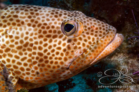 A patient grouper allows me to capture his portrait. A patient grouper allows me to capture his portrait. Focus The eyes have it. One of the biggest rules of macro photography is that if nothing else is in focus, make sure the eyes are. As I said, I am using the auto-focus feature, and while I am struggling with light placement, exposure, and my own buoyancy, not to mention a critter that may or may not be a cooperative subject, it is very difficult to ensure the eyes are in focus on a tiny fellow. With a new port for my macro lens in the budget for next year, and a focusing gear for manually adjusting, my focussing results may improve. But then, the proof is in the putting, isn’t it? While I generally would like to have my aperture very small (f8 – f22 or more) to ensure adequate depth of field on tiny marine friends, there is something to be said for a large aperture, and allowing a great deal of the image to be out of focus; distracting backgrounds can be blurred away to draw the eye to your subject's eyes, transforming a mundane and ok image, to spectacular. I doubt I will be attempting this feat until I have more control over my focus controls, though! 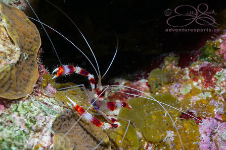 Red and White Coral banded shrimp comes out to hunt for bloodworms on a night dive. Red and White Coral banded shrimp comes out to hunt for bloodworms on a night dive. Finding Subjects This part is a great deal of fun, and it helps a lot when your dive buddy has sharp eyes (thanks Anne)! I found that this dive trip with my new macro lens was a completely different – and rewarding – experience than other dive excursions. Rather than swimming along looking for large animals, I found we were slowly inspecting the coral formations and finding little things that we have never seen before! It was amazing! Now I keep an eye out for cleaning stations in hopes of capturing images of this kind of animal interaction, as these tiny guys are so interesting! At night it seems easier to find the small things. Stephen and I approached the base of a coral formation, and tucked our lights in close – the blood worms immediately start swarming our lights, and we soon saw the waving antennae of a coral banded shrimp coming out to pluck a blood worm for dinner! 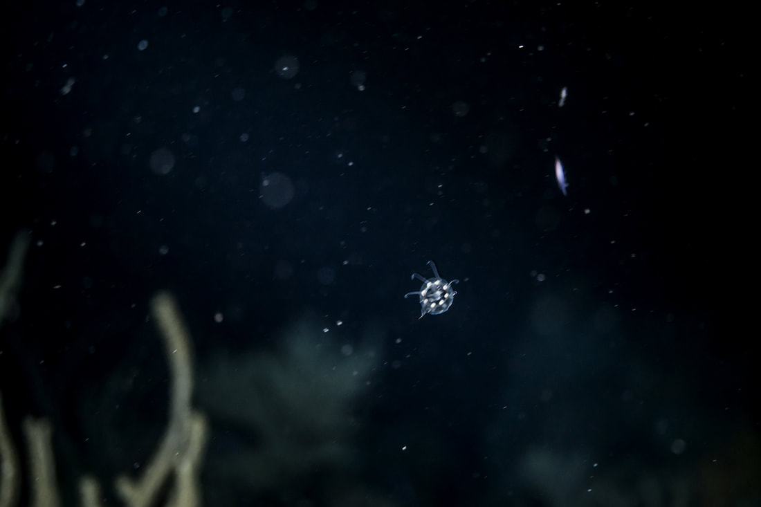 Scanning the water at night for little creatures helped me find this tiny jellyfish...unfortunately he is out of focus. On another night dive, I found if I “scanned” the black open water around me by sweeping my light side to side, I could find other small things in the open water. One of these was the small squid already mentioned, but also I found a couple of very, tiny jellyfish – no bigger than the tip of my pinky. My camera simply could not focus on this tiny creature, and this is the best I could manage. I think perhaps I would have been better off to try and get my finger in the shot beside it for focusing purposes. All the same, he was pretty cool to see! Now I am in the habit of looking around the base of vase and barrel sponges, searching for the tell-tale antennae of the cleaner shrimp, and inspecting the branches of coral and sea fans for nudibranchs. We have an Indonesia trip coming up in 2019, and are currently researching the best places to find little critters there. For instance, beautiful Coleman shrimp can sometimes be found living with their mate on fire urchins. Emperor shrimp will hitch a ride on a sea cucumber (the TTC of the sea, apparently), to safely travel from one coral head to another, but also to snack on parasites that live on the skin. Pearl fish actually live in the anus of the sea cucumber for safety, so we will be checking out that little crevice as well. Harlequin shrimp can be found living on blue starfish, and so on and so on… Isn’t it amazing!?? Love it all! MY biggest challenge is that I am a chronic “rusher”. I rush at everything, so going slow is totally counter-intuitive to my very essence. It’s a wonder that Jody and I are even married to each other, as his “M-O” is the antithesis of my hurrying nature. But I digress… Cool Details And check this out for "cool" - So many of my images hold much more than I ever realized when I took the photo initially! The title image at top of this clinging channel crab, has so much more detail than I ever noticed...until, that is, I was editing the shot: 1. The eyes of this crab are stunning! They are yellowish and speckled, and completely gorgeous, but I never saw that until I was adjusting the contrast of the file. 2. The yellow ball between the eyes might be a coral egg? Hey, if you KNOW that to be true or untrue, could you please add a comment? I'm pretty sure it is, but you never know... 3. The black blobish things on the crab could be some kind of organism, but I don't know what. At least not yet. 4. There appears to be some kind of soft coral (purplish) growing on its head. Could it be? How did I miss all those cool details??! And how delightful to have an opportunity to scrutinize these critters later! Crab-face below:  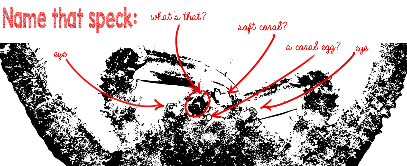 Also, in the 5 minute video compilation we put together, I can see a yellowline arrow crab on a coral head that a large clinging channel crab is crawling around. It seems every time I watch, I notice something new! And even in the image below, where I found a lettuce sea slug, I didn't notice the second one, just peeping around the corner! I love finding these new things! 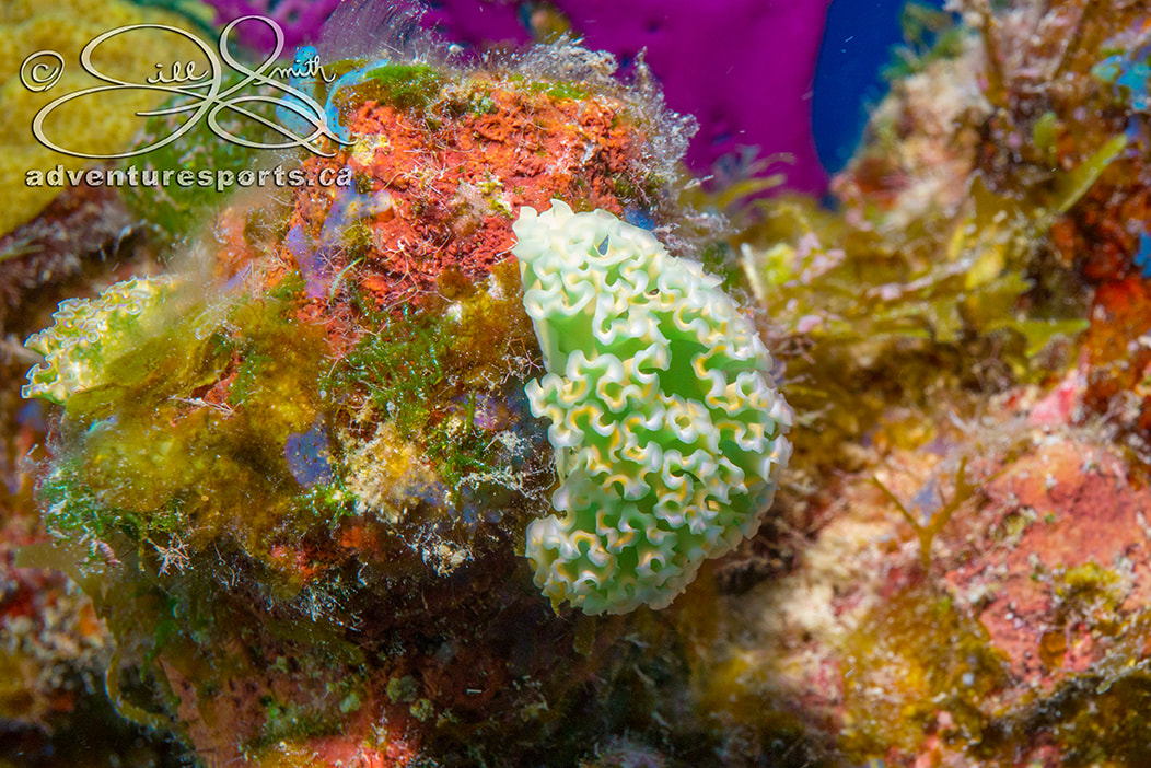 A lettuce Sea Slug on coral Our Roatan scuba adventure is coming up in February, and we will all be trying to improve our shutterbug skills in an effort to come up with something even better! Can’t wait!
By Jill Smith An Adobe Photoshop ® tutorial This is a colour correcting technique that may be employed in Adobe Photoshop ® using the Curves contrast adjustment tool in conjunction with LAB colour mode. Convert an image to LAB colour mode, and apply curves to the channels individually to knock out extreme colour casts, boost colour and even make very specific changes to colours all in one fell swoop. 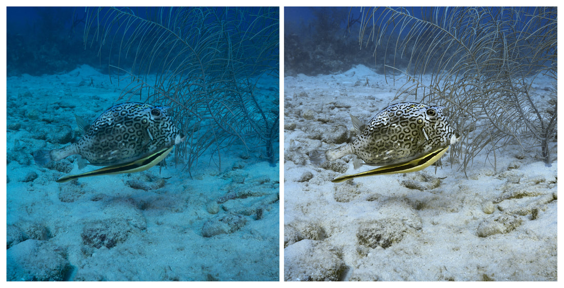 Colour Correction with Curves and LAB Colour Mode A LITTLE ABOUT CURVES: The Curves dialogue box is another graph mapping all of the tonal values on a straight diagonal line. The steeper the curve, the more contrast between the tonal values in the steep part of the curve; the flatter the curve, the flatter the contrast in the tones of that area of the curve. Click within the image, and a small circle will appear on the curve where that tonal value is represented. You can set a point on this line by clicking on the line directly, or by Ctrl-clicking within the image to plot that specific value on the line of the curve. Up to 14 control points can be added to the curve; this allows for very precise control when adjusting contrast. Each point may be edited separately. A LITTLE ABOUT LAB COLOUR MODE: LAB Colour mode consists of 3 channels much like RGB; however, the similarities end there. The LAB channels:
First, let’s illustrate the concept of LAB with this jacket to help us understand using Curves with the LAB channels better. Objective: We have decided to change this image of a blue and black jacket to a red and black jacket. 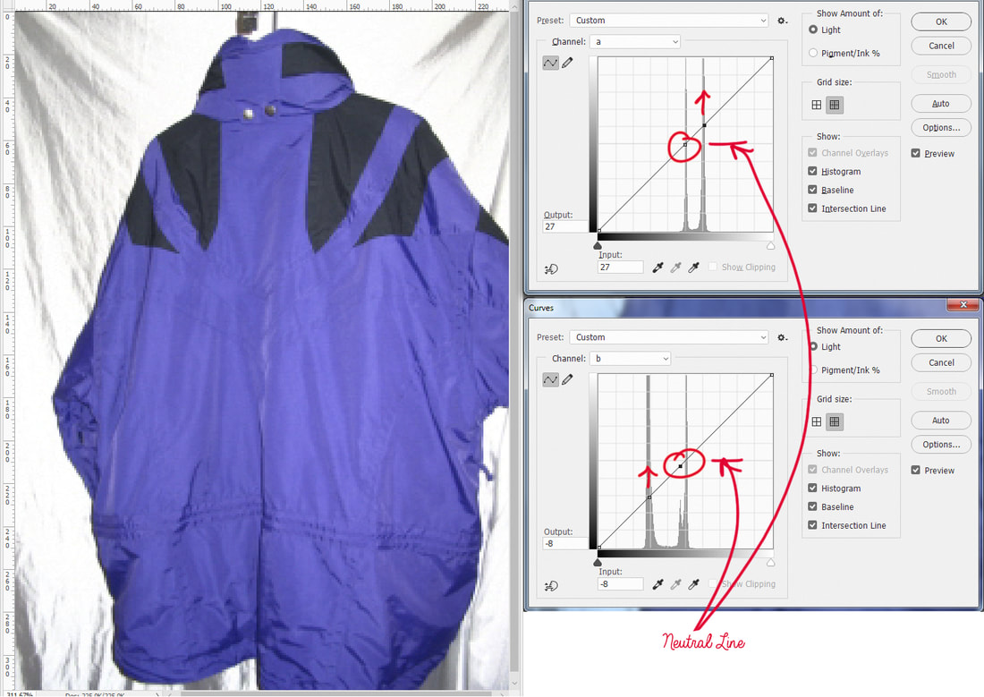 Original Jacket on the left. Top right, curves open for "a" channel. Bottom right, curves open for "b" channel. The image has been converted to LAB Colour Mode (Image > Mode > Lab Colour), and the Curves dialogue box is open - Image > Adjustments > Curves (Ctrl - M for PC /Command –M for Mac). Note: Both of these Curves graphs plot the colour values along the diagonal line (top graph is for "a" channel, bottom graph is for "b" channel). Adjustments in a and b will affect colour, but not contrast. About "a" channel curve: Values that are plotted on the mid-neutral line in the center are neutral (neither green nor magenta). Values plotted above the neutral line are more magenta than green, increasing in intensity the higher it goes. Conversely, values plotted below the mid line are more green than magenta. About "b" channel curve: Values that are plotted on the mid-neutral line in the center are neutral (neither blue nor yellow). Values plotted above the neutral line are more yellow than blue, increasing in intensity the higher it goes. Conversely, values plotted below the mid line are more blue than yellow. Top Right ("a" channel curve): Above the graph display the Channel selection (drop-down box) has been changed from "Lightness" to "a" (I am satisfied with the brightness and contrast of this image, so I am not going to adjust curves on the Lightness channel). The "a" channel contains all of the green and magenta colour information. There are two values plotted on the graph. The top one was selected by Ctrl-clicking (Command-clicking for Mac) a good representation of the black fabric around the shoulders and the neck (do not take the sample from either the highlights or the shadows). It is seen plotted on the mid-neutral line of the graph, meaning it is neither magenta nor green. The bottom value was plotted by Ctrl-clicking a good representation of the blue fabric (neither highlight nor shadow). This value is plotted well above the mid-neutral line, indicating there is more magenta than green in the colour of the jacket. The red arrow on the graph shows the direction we are going to take this value when we edit (next). Bottom Right ("b" channel curve): The bottom curve shows the graph for the "b" channel containing all of the blue and yellow colour information. Again, a value representing the black has been plotted on this graph-line by Ctrl-clicking a good representation of that tone in the image. This time, the value is not plotted exactly on the mid-neutral line, but a little bit below, indicating either a blue colour cast, or perhaps the true colour of the fabric is navy blue. Below that (still see the figure above, the graph below the "a" graph), is another point that has been plotted on the line to represent the blue values in the jacket, and again, the red arrow on the graph illustrates the direction this value is going to be moved when we edit. Editing the Value Points: 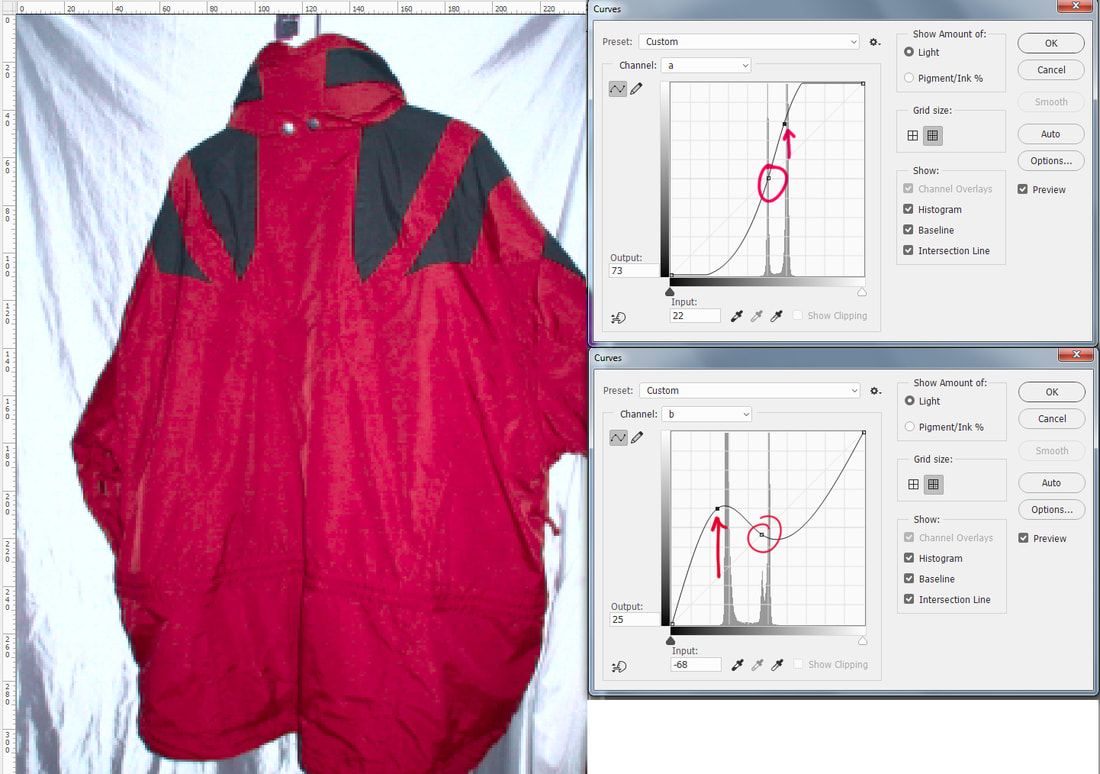 The curves display for both the "a" channel (top), and the "b" channel (bottom). Now let's edit those points.
That's it, look Ma, no selections! This is an easy example, because the background is blank and relatively neutral, but it is a great image to introduce the concepts. Now let's colour correct an underwater image. Applying Curves with LAB Colour Mode in an Underwater Image 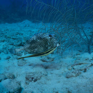 Original image of Honey comb trunkfish Original image of Honey comb trunkfish I've never met an underwater image that didn't need some help, and this image can do with some pretty drastic adjustments in LAB. This Honeycomb Trunkfish and small yellow remora riding under him, is underexposed, and the colour cast is very cyan. At a glance, the water in the background looks like it has too much magenta in it too. First step is to open the image and convert to LAB (Image > Mode > LAB colour). Then open Curves (Image > Adjustments > Curves, or Ctrl-M/Command M for keyboard shortcut). The default Channel selected is the Lightness channel. That is where we will start. 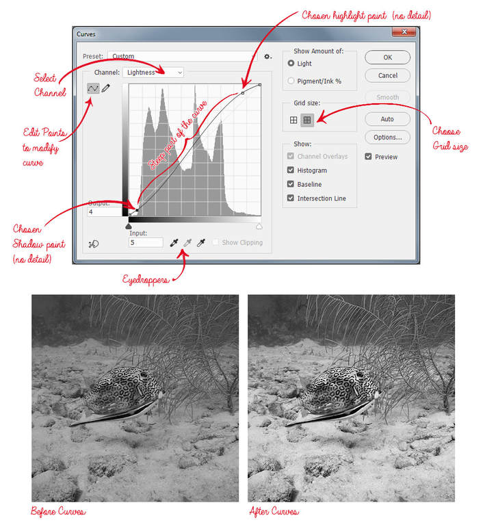 Adjustments to the Lightness channel only Adjustments to the Lightness channel only By clicking and dragging the cursor over the image it is possible to see where the values are plotted on the curve; note the lightest area of the image with detail (mouth of the trunkfish), and where that resides on the curve. Instead of Ctrl-clicking though, I click a value on the line above the lightness values of the mouth. This is because I want to keep the detail of mouth in the steepest part of the curve for contrast and detail (I don't count spectral highlights as important detail - there aren't any in this image anyway). The highlight point is dragged up significantly to lighten the image, and increase contrast, while watching the mouth area to make sure it isn't being clipped. To set the shadow, find the darkest values of the area of interest, and see where that value lives on the curve. Then manually click a point below that, and lower it to darken shadows and increase contrast. The curve now has an "S" shape, and all of the values of the image that are important detail, reside in the steep part of the S, creating more contrast. At the extreme bottom and top of the S, the darkest shadows and the lightest highlights are actually flattened and have less contrast. It may be helpful to remember that when adjusting the curve for contrast, while one part of the curve is made steeper to increase it, another part of it will be flattened, decreasing it. 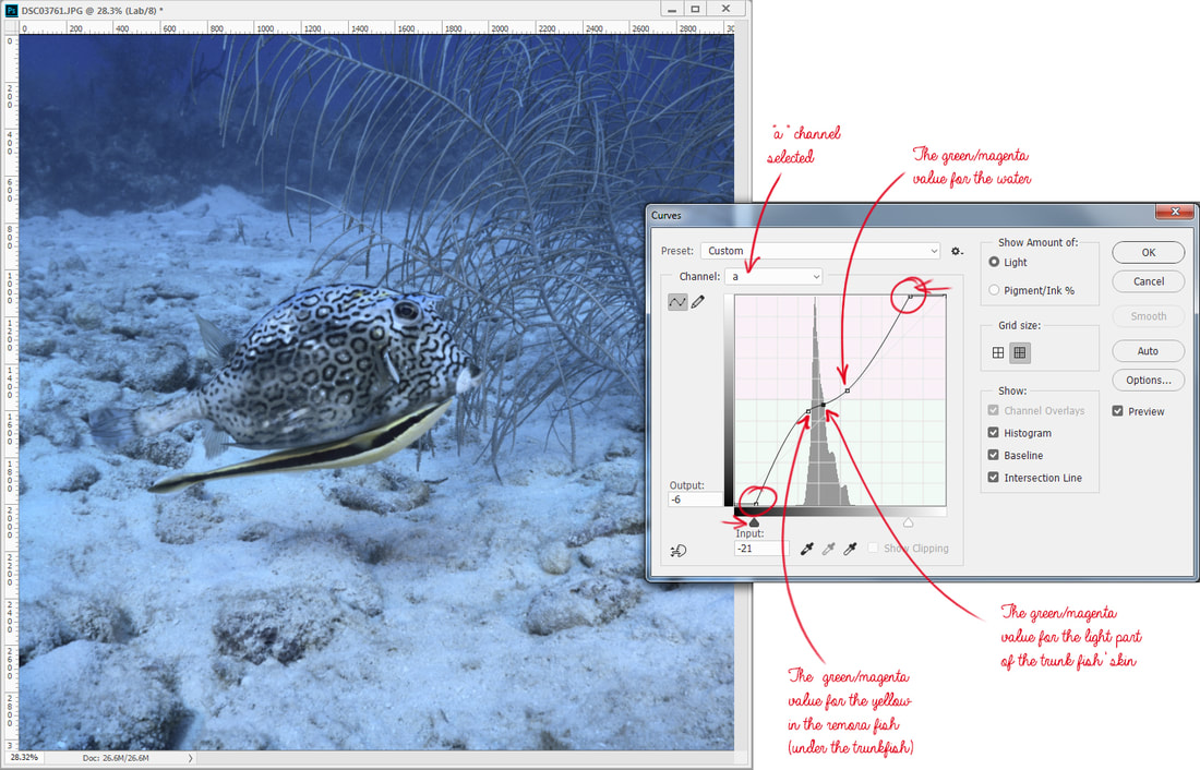 Adjusting Curves on the "a" channel Above is the Curves adjustment for "a" channel (selected from the dropdown Channel menu):
For now, 3 points plotted is enough, although plotting a point for the sandy area roughly on the same plane as our fish would not be a bad idea either, but we'll check those values after we make some adjustments. Clicking the water value, pull it straight down to the green. Push the Trunkfish's skin value to the neutral, and drag the remora's yellow value up towards yellow. At this point, check the sand value near the fish , and try to keep it close to neutral, or even slightly warm in the magenta, but not too much. The sand in the distance may retain some blue values, and that is acceptable because it is natural-looking. The colour still doesn't look right, and that is ok, because we haven't adjusted any colour in yellow/blue yet. 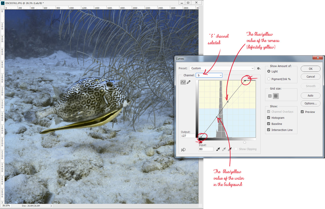 Adjusting Curves on the "b" channel Above is the Curves adjustment for "b" channel (selected from the dropdown Channel menu):
The remora yellow may be raised a bit to make it a more intense yellow, but care must be taken to not introduce too much yellow to the sand. The sand may be a little yellow, but should not be as intense as our little remora. If the sand became too yellow, it may be plotted on the curve and pulled down a little. You have so much control here! 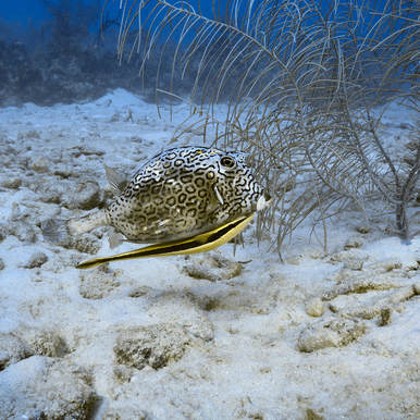 Final result Final result If sharpening is desired, sharpen on the Lightness channel before converting back to RGB to avoid colour distortion around edges. Then I do any minor tweaking in RGB, and I'm done! I do love that I can control the colour and the intensity of a colour in an image using LAB and Curves; even two colours that are very similar may be pulled apart to be made more distinctive. I hope you find this colour mode to be useful to you; it has become one of my favourite tools in more ways than one. This is a pretty quick and dirty introduction to a very comprehensive colour mode/topic. Want to learn more? Here is a great resource written by one of my favourite instructors, Dan Margulis (now semi-retired): Margulis, D.2006.Photoshop LAB Color: The Canyon Conundrum and Other Adventures in the Most Powerful Colorspace.California:Peachpit Press. |
 FlickrAlbumAuthorsJill Smith 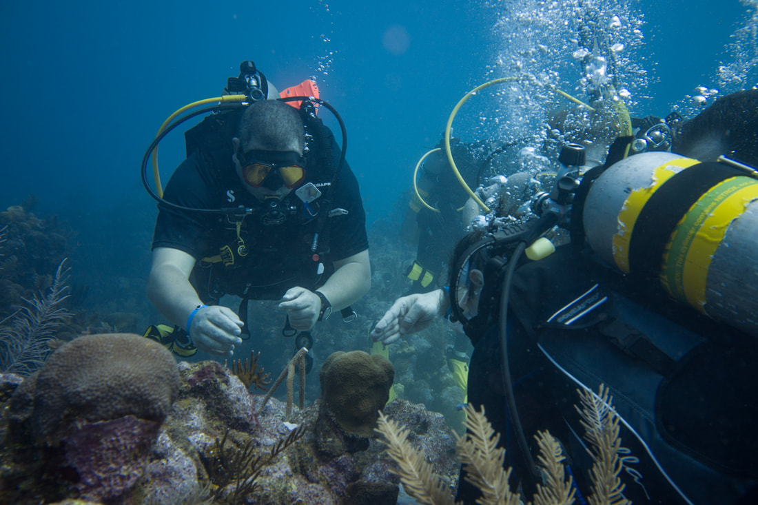
Coral Restoration
Archives
January 2024
Categories
All
 
|
 RSS Feed
Our Services |
Company |
SupportOur Blog
|
|
Copyright © 2014
|
Newmarket, ON
|
(905) 898 5338
|