|
By Jill Smith An Adobe Photoshop ® tutorial This is a colour correcting technique that may be employed in Adobe Photoshop ® using the Curves contrast adjustment tool in conjunction with LAB colour mode. Convert an image to LAB colour mode, and apply curves to the channels individually to knock out extreme colour casts, boost colour and even make very specific changes to colours all in one fell swoop. A LITTLE ABOUT CURVES: The Curves dialogue box is another graph mapping all of the tonal values on a straight diagonal line. The steeper the curve, the more contrast between the tonal values in the steep part of the curve; the flatter the curve, the flatter the contrast in the tones of that area of the curve. Click within the image, and a small circle will appear on the curve where that tonal value is represented. You can set a point on this line by clicking on the line directly, or by Ctrl-clicking within the image to plot that specific value on the line of the curve. Up to 14 control points can be added to the curve; this allows for very precise control when adjusting contrast. Each point may be edited separately. A LITTLE ABOUT LAB COLOUR MODE: LAB Colour mode consists of 3 channels much like RGB; however, the similarities end there. The LAB channels:
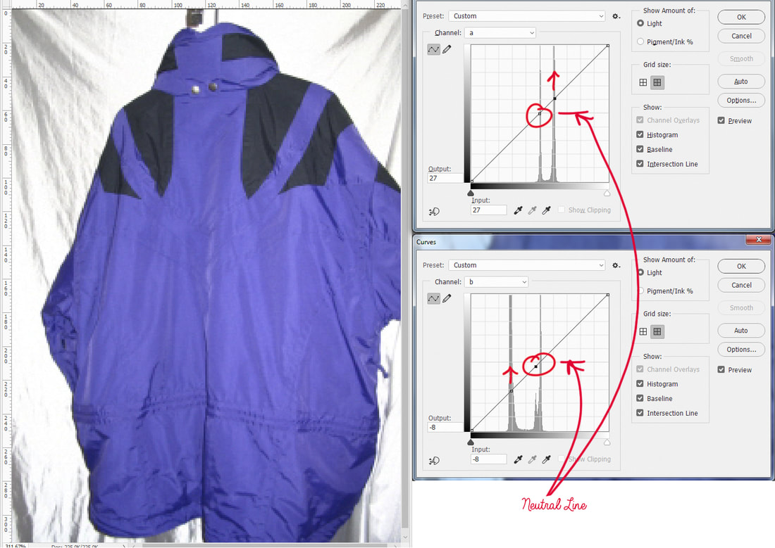
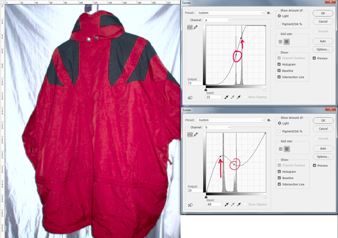
First, let’s illustrate the concept of LAB with this jacket to help us understand using Curves with the LAB channels better. Objective: We have decided to change this image of a blue and black jacket to a red and black jacket. The image has been converted to LAB Colour Mode (Image > Mode > Lab Colour), and the Curves dialogue box is open - Image > Adjustments > Curves (Ctrl - M for PC /Command –M for Mac). Note: Both of these Curves graphs plot the colour values along the diagonal line (top graph is for "a" channel, bottom graph is for "b" channel). Adjustments in a and b will affect colour, but not contrast. About "a" channel curve: Values that are plotted on the mid-neutral line in the center are neutral (neither green nor magenta). Values plotted above the neutral line are more magenta than green, increasing in intensity the higher it goes. Conversely, values plotted below the mid line are more green than magenta. About "b" channel curve: Values that are plotted on the mid-neutral line in the center are neutral (neither blue nor yellow). Values plotted above the neutral line are more yellow than blue, increasing in intensity the higher it goes. Conversely, values plotted below the mid line are more blue than yellow. Top Right ("a" channel curve): Above the graph display the Channel selection (drop-down box) has been changed from "Lightness" to "a" (I am satisfied with the brightness and contrast of this image, so I am not going to adjust curves on the Lightness channel). The "a" channel contains all of the green and magenta colour information. There are two values plotted on the graph. The top one was selected by Ctrl-clicking (Command-clicking for Mac) a good representation of the black fabric around the shoulders and the neck (do not take the sample from either the highlights or the shadows). It is seen plotted on the mid-neutral line of the graph, meaning it is neither magenta nor green. The bottom value was plotted by Ctrl-clicking a good representation of the blue fabric (neither highlight nor shadow). This value is plotted well above the mid-neutral line, indicating there is more magenta than green in the colour of the jacket. The red arrow on the graph shows the direction we are going to take this value when we edit (next). Bottom Right ("b" channel curve): The bottom curve shows the graph for the "b" channel containing all of the blue and yellow colour information. Again, a value representing the black has been plotted on this graph-line by Ctrl-clicking a good representation of that tone in the image. This time, the value is not plotted exactly on the mid-neutral line, but a little bit below, indicating either a blue colour cast, or perhaps the true colour of the fabric is navy blue. Below that (still see the figure above, the graph below the "a" graph), is another point that has been plotted on the line to represent the blue values in the jacket, and again, the red arrow on the graph illustrates the direction this value is going to be moved when we edit. Editing the Value Points: Now let's edit those points.
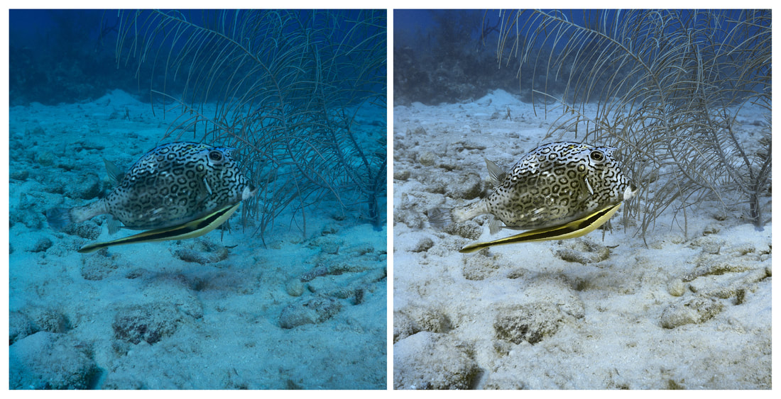
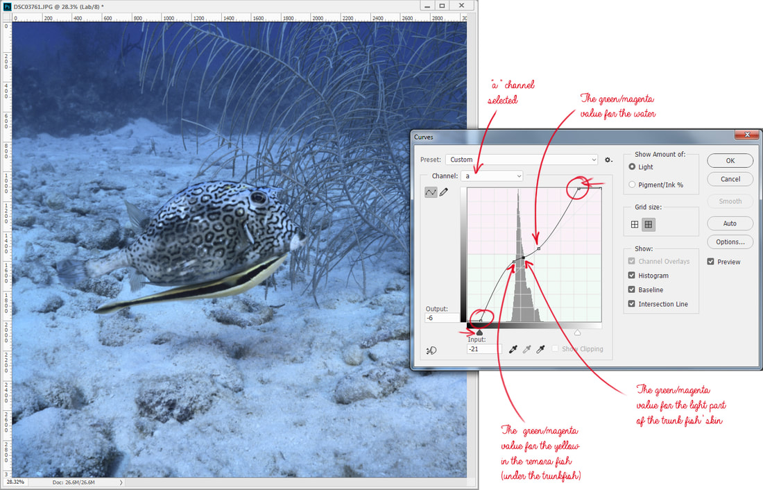
That's it, look Ma, no selections! This is an easy example, because the background is blank and relatively neutral, but it is a great image to introduce the concepts. Now let's colour correct an underwater image. Applying Curves with LAB Colour Mode in an Underwater Image 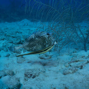 Original image of Honey comb trunkfish Original image of Honey comb trunkfish I've never met an underwater image that didn't need some help, and this image can do with some pretty drastic adjustments in LAB. This Honeycomb Trunkfish and small yellow remora riding under him, is underexposed, and the colour cast is very cyan. At a glance, the water in the background looks like it has too much magenta in it too. First step is to open the image and convert to LAB (Image > Mode > LAB colour). Then open Curves (Image > Adjustments > Curves, or Ctrl-M/Command M for keyboard shortcut). The default Channel selected is the Lightness channel. That is where we will start. 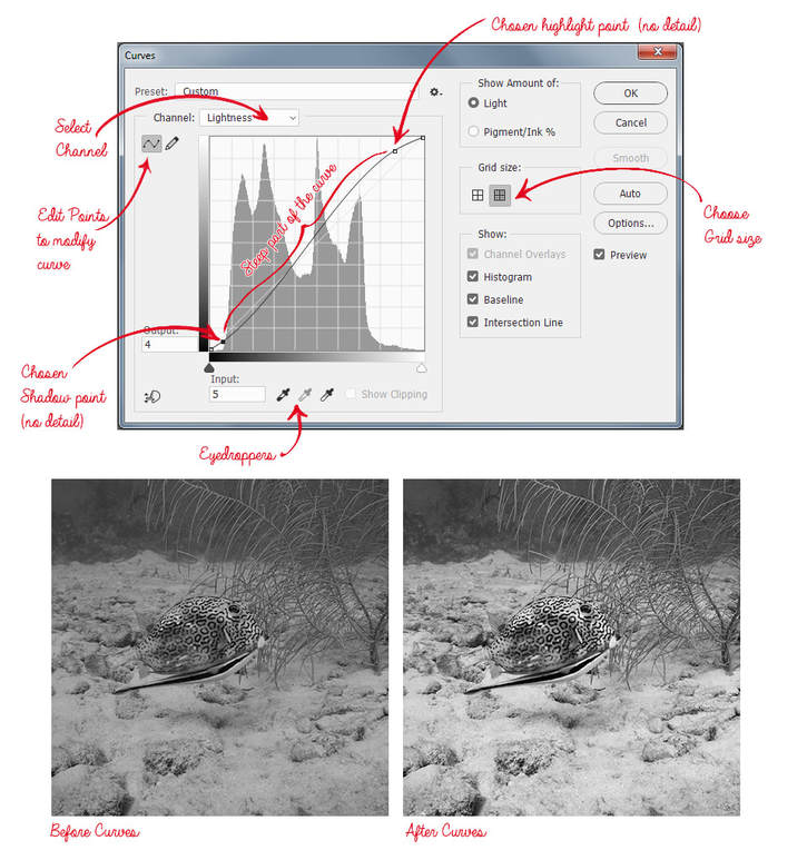 Adjustments to the Lightness channel only Adjustments to the Lightness channel only By clicking and dragging the cursor over the image it is possible to see where the values are plotted on the curve; note the lightest area of the image with detail (mouth of the trunkfish), and where that resides on the curve. Instead of Ctrl-clicking though, I click a value on the line above the lightness values of the mouth. This is because I want to keep the detail of mouth in the steepest part of the curve for contrast and detail (I don't count spectral highlights as important detail - there aren't any in this image anyway). The highlight point is dragged up significantly to lighten the image, and increase contrast, while watching the mouth area to make sure it isn't being clipped. To set the shadow, find the darkest values of the area of interest, and see where that value lives on the curve. Then manually click a point below that, and lower it to darken shadows and increase contrast. The curve now has an "S" shape, and all of the values of the image that are important detail, reside in the steep part of the S, creating more contrast. At the extreme bottom and top of the S, the darkest shadows and the lightest highlights are actually flattened and have less contrast. It may be helpful to remember that when adjusting the curve for contrast, while one part of the curve is made steeper to increase it, another part of it will be flattened, decreasing it. Above is the Curves adjustment for "a" channel (selected from the dropdown Channel menu):
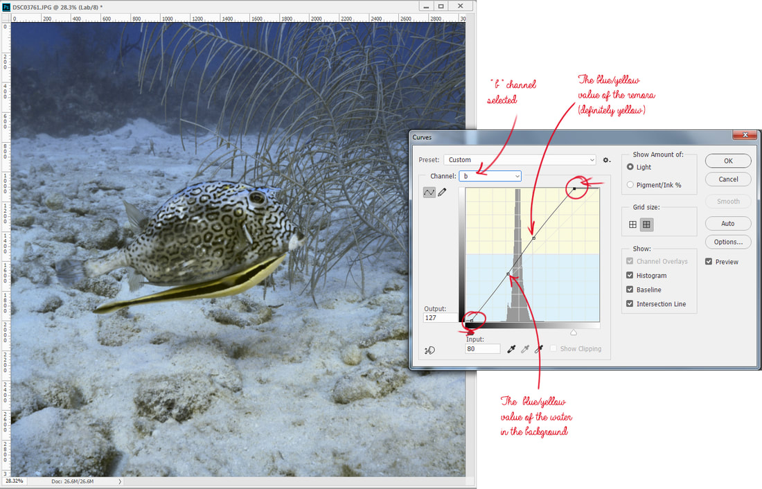
For now, 3 points plotted is enough, although plotting a point for the sandy area roughly on the same plane as our fish would not be a bad idea either, but we'll check those values after we make some adjustments. Clicking the water value, pull it straight down to the green. Push the Trunkfish's skin value to the neutral, and drag the remora's yellow value up towards yellow. At this point, check the sand value near the fish , and try to keep it close to neutral, or even slightly warm in the magenta, but not too much. The sand in the distance may retain some blue values, and that is acceptable because it is natural-looking. The colour still doesn't look right, and that is ok, because we haven't adjusted any colour in yellow/blue yet. Above is the Curves adjustment for "b" channel (selected from the dropdown Channel menu):
The remora yellow may be raised a bit to make it a more intense yellow, but care must be taken to not introduce too much yellow to the sand. The sand may be a little yellow, but should not be as intense as our little remora. If the sand became too yellow, it may be plotted on the curve and pulled down a little. You have so much control here! 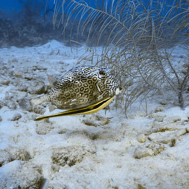 Final result Final result If sharpening is desired, sharpen on the Lightness channel before converting back to RGB to avoid colour distortion around edges. Then I do any minor tweaking in RGB, and I'm done! I do love that I can control the colour and the intensity of a colour in an image using LAB and Curves; even two colours that are very similar may be pulled apart to be made more distinctive. I hope you find this colour mode to be useful to you; it has become one of my favourite tools in more ways than one. This is a pretty quick and dirty introduction to a very comprehensive colour mode/topic. Want to learn more? Here is a great resource written by one of my favourite instructors, Dan Margulis (now semi-retired): Margulis, D.2006.Photoshop LAB Color: The Canyon Conundrum and Other Adventures in the Most Powerful Colorspace.California:Peachpit Press.
3 Comments
22/9/2017 08:04:06 pm
Thanks Jill. I have access to Photoshop through work and I will try this out! I'm also going to need to update my camera from the 2005 model I have right now.
Reply
25/9/2017 07:51:46 am
I hope you love it, Chris!
Reply
Leave a Reply. |
FlickrAlbumAuthorsJill Smith Archives
January 2024
Categories
All
|
Our Services |
Company |
SupportOur Blog
|
|
Copyright © 2014
|
Newmarket, ON
|
(905) 898 5338
|


 RSS Feed

