
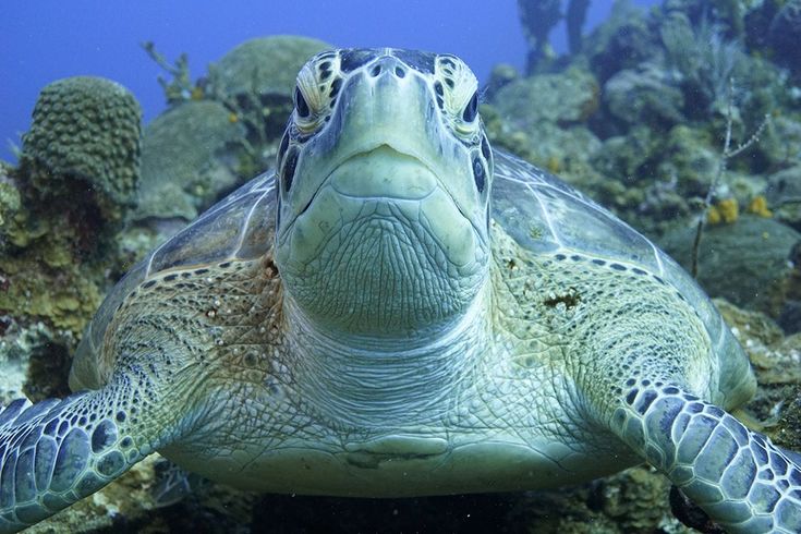
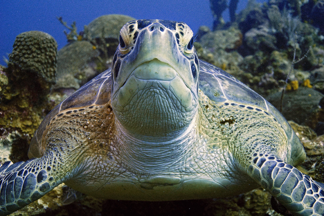
 The original image straight from the camera The original image straight from the camera - In our ORIGINAL jpg image (above) straight from the camera, we have a green sea turtle who is looking rather green. I don't think he has eaten a bad jellyfish, but rather, there is a bit of a green/cyan colour cast that is typical of underwater photography. Most photo editing software applications can handle this with ease. We do want to watch the colour of the water, and of the yellow sponges in the background as we adjust, to try and keep the colours true to life. So here it is, the colour corrections of this turtle from multiple photographers/editors. I love how we get to experience the different feeling and mood of the same image, depending on the photographer's interpretation. Not only that, but we get an introduction to the different types of colour correcting software available out there, and many may find that very useful! If you have questions about the software someone used, please go ahead and leave a question in the comments - we can forward your question, or the photographer can answer it right there! Enjoy!  Alex S. - Vivid Pix - Changed the light balance, took some of the depth out of the picture adding some of the colours back into the picture creating a more vivid image. Software used: Vividpix The punchy detail looks amazing, and the water is still blue, and that is the pitfall in this type of image! Next to Alex's edit, the original looks incredibly flat! He's beauty, nice edit!  Dan P. - Gimp photo software - Removed the green colours and increased contrast. Software used: Gimp The contrast is better, and the green cast has been removed from the turtle, but this is the hard part: removing the green cast without turning the water pink! The complementary colour to green is magenta, so introducing it into the image does effectively knock out that green, but at the expense of turning the water magenta! If there are HSL sliders or selective colour functions in Gimp, that might be a place to target the blue/pink water separately, without turning the turtle green again. Good work!  Mike M. - Adobe Photoshop - Worked from JPG. Mainly just adjusted the levels of each RGB channel and did some shadow/highlight changes. Software used: Adobe Photoshop I like the warmth of the colours in the turtle's shell and skin, very nice. The green cast has been addressed successfully, although there is a little bit of magenta creeping into the water behind the turtle. Selective colour (Image > adjustments > Selective Colour) can touch up the blue a bit, or the Hue Saturation box can be used to just target the blues. Looks great - nice edit! 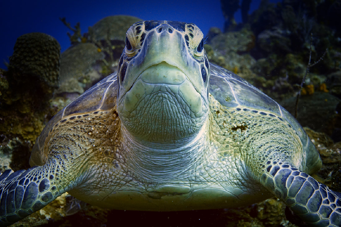 Emma F - ACDsee - used reds and yellows for turtle and layers to create a soft dark frame. Software used: ACDSee Well, the green cast is gone, and though at first glance it seems rather dark, I find it interesting. Nice work! 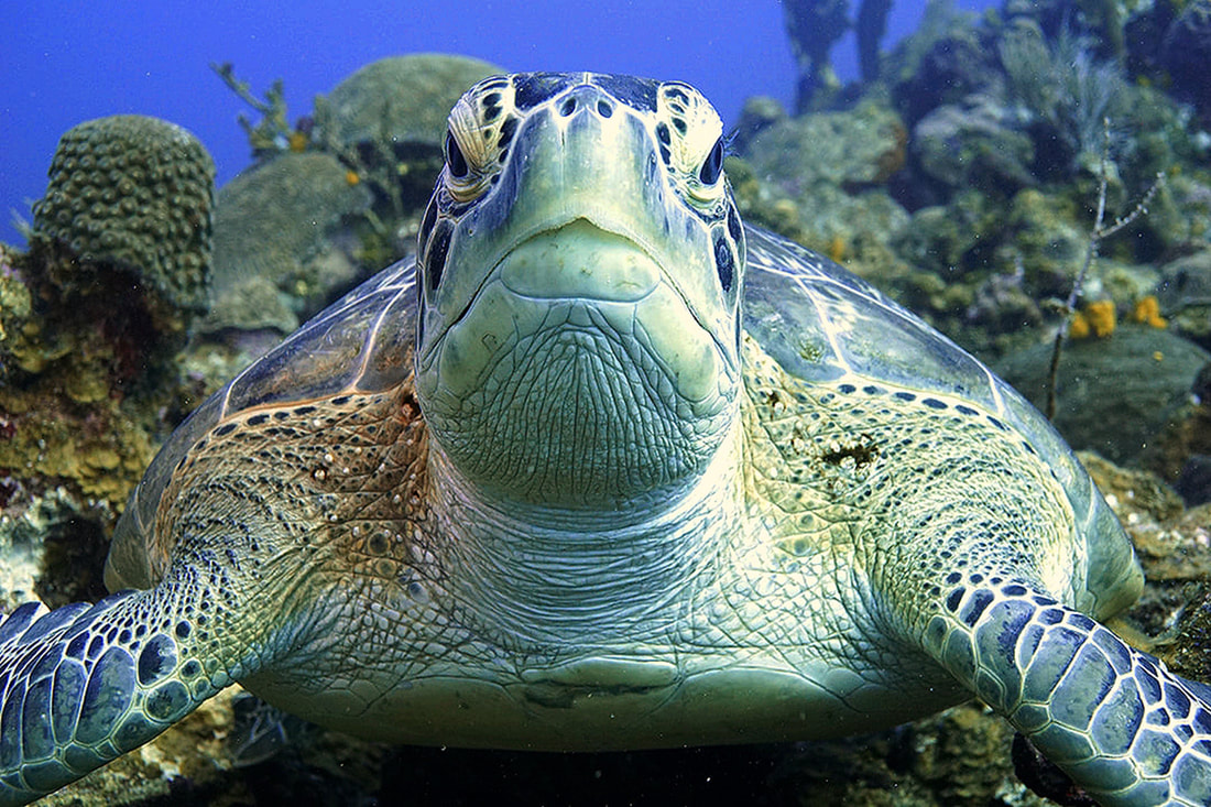 Ian G. - Latest Paint Shop Pro - From the .jpg, I added 9% red, took out 9% green and 15% blue, gamma corrected to -0.80, added 20% saturation, and added a bit of a sharpness filter. Software used: ACDsee from RAW file I like the warmth of the turtle, though there seems to be a bit of grain introduced (creative effect)? The warm detail has been preserved on the right side of his face (his left) over the eye, where it tends to get lost very quickly in editing. Nice work! 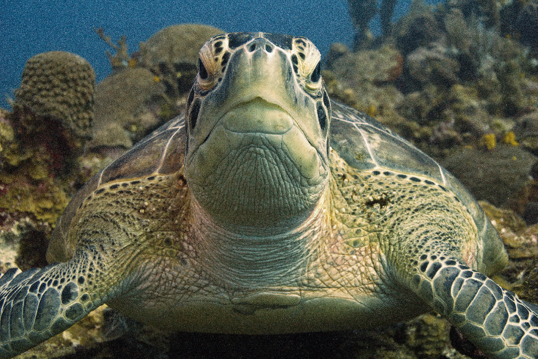 Rick B - ACDsee Pro - Turtle 2.3 - Clearly I have too much time on my hands (lol, Rick) So in total: white balance, dehaze, sharpen, colour adjust shoulder areas, reduced overall blues/violet/mauves, removed speckling below and beside turtle and removed the random twig from right side (of picture) behind turtle Software used: ACDsee from RAW file I like the warmth of the turtle, though there seems to be a bit of grain introduced (creative effect)? The warm detail has been preserved on the right side of his face (his left) over the eye, where it tends to get lost very quickly in editing. Nice work! It's fascinating how different every one of these corrected images look, and I have always found that I learned a lot from these exercises in class, noting the techniques I wanted to employ next time, and pitfalls I knew I needed to avoid in order to achieve what I wanted. Colours, vignettes, detail, and saturation variations can all contribute to mood, so when you have many editors working on the same file, you never know what you are going to get. Thank-you to everyone who participated in our experiment. If you are interested in trying another one, drop us a comment below!
1 Comment
|
 FlickrAlbumAuthorsJill Smith 
Coral Restoration
Archives
January 2024
Categories
All
 
|
 RSS Feed
Our Services |
Company |
SupportOur Blog
|
|
Copyright © 2014
|
Newmarket, ON
|
(905) 898 5338
|