
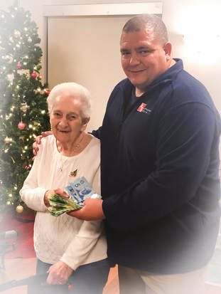
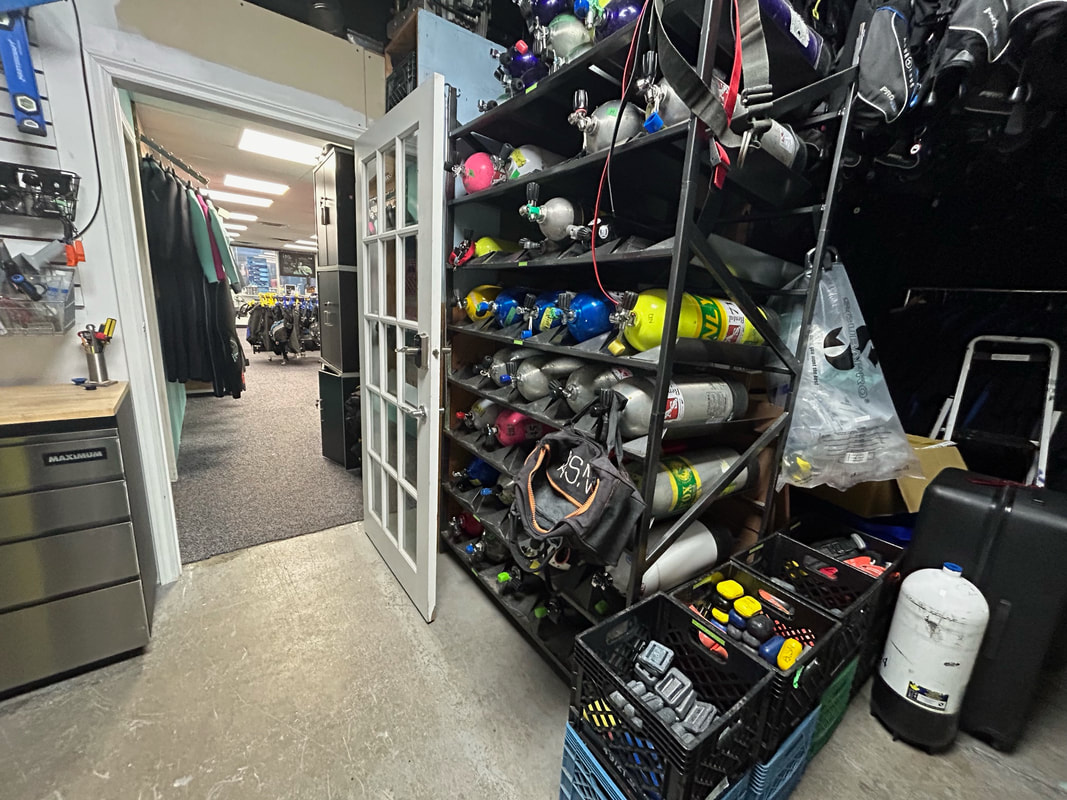
 Thank-you to everyone who came out to make our Christmas party a huge success! We are very happy to report that we were able to donate over $1900 to Marjorie's toy-box at the Southlake hospital for the children that must go to endure ongoing treatments for cancer and other serious illnesses. Marjorie, we are very grateful to have you doing all the special and loving things you do for these children, thank-you from all of us - we hope that our contribution continues to help you to help them every day. Prizes and Winners: Blackbeard's Liveaboard trip donated by Allstar Liveaboards: Craig Martion Amphos dive computer donated by Adventure Sports: Martin Kluchert Aqualung dive computer donated by Aqualung: Charlene Suchy Mask, snorkel, and fins package donated by Sherwood: Brenda Kellett Beautiful gift basket created and donated by Dawn and Pierre Belley: Scuba John Those were the bigger prizes, and there were many other winners too, so congratulations to all of them, and many thanks to all of the donors! We would also like to say thank-you to Hannah, our bartender, who decided to donate all of her tips for the night to Marjorie's toy-box too! What big hearts we had in that room Saturday night; we could feel the love, and it was very touching. So proud to be a part of this group. Please have a safe and happy Christmas - if you are celebrating other holidays, then we wish you happiness in them too. xo Be safe.
0 Comments
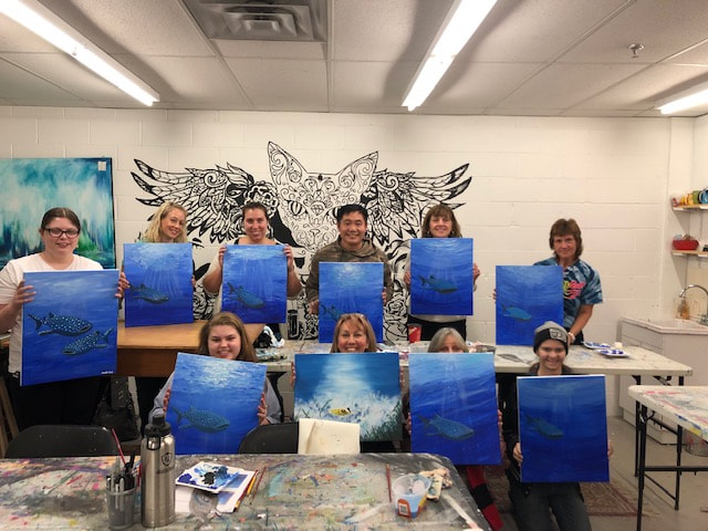
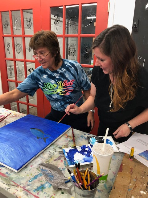
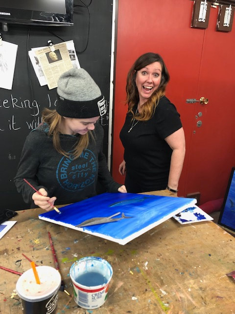
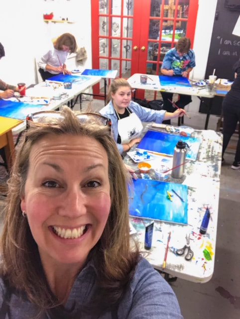
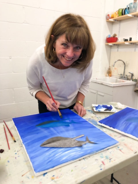
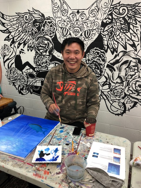
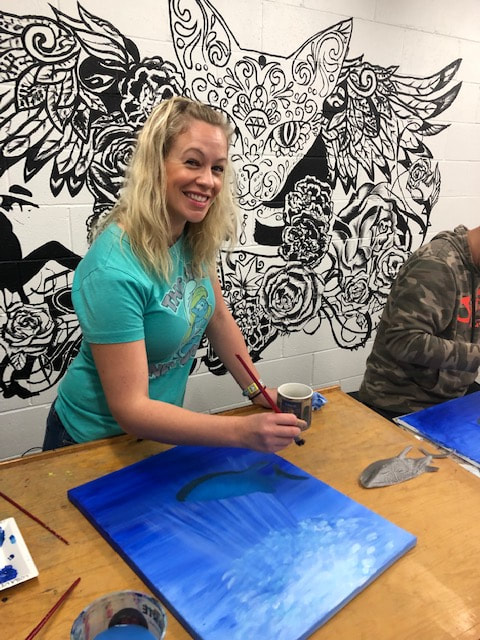
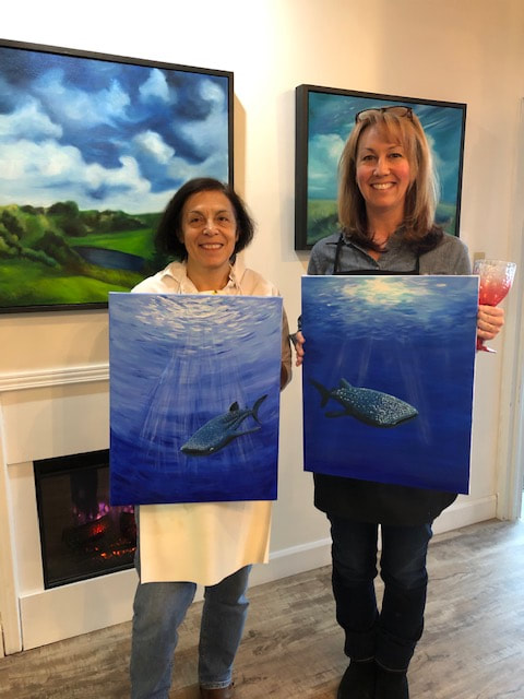
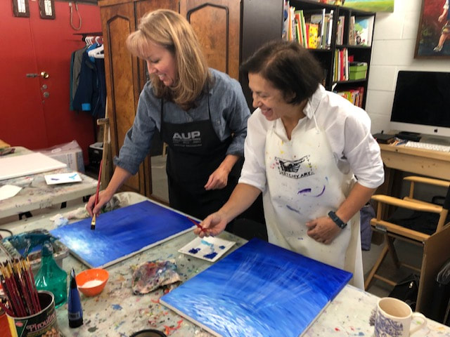
 Elizabeth and Jill showcase their whale shark art! Elizabeth and Jill showcase their whale shark art! Whale Shark Painting Class All of us ocean enthusiasts had a great time painting whale sharks with artist Catherine Farquhar at her One Sketchy Art Studio last Saturday night! Catherine has donated her framed canvas painting for raffle, so that the proceeds can go to the ongoing ocean conservation efforts of the Project Aware organization. Thank-you Catherine! We will be drawing the winner on Tuesday, November 13 at our monthly club meeting. Good luck, everyone! 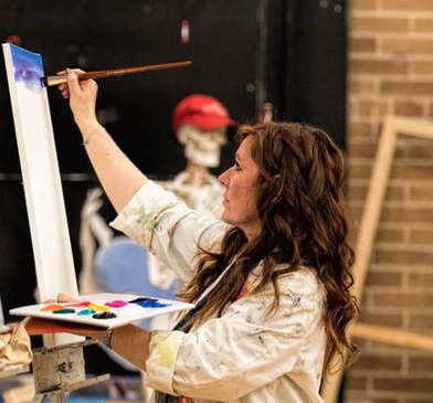 Catherine at work Catherine at work Artist Catherine Farquhar One Sketchy Art Studio "If you've got the party, we've got the time...and the studio and gallery and the paint and brushes and the one-on-one professional art instruction for every party guest. Catherine has formal training in drawing and painting. Her work appears in local shows and in private collections. She approaches teaching art as a form of creative mentoring, encouraging the imagination and confidence of the beginner while challenging the experienced artist with the insights of a collaborator."
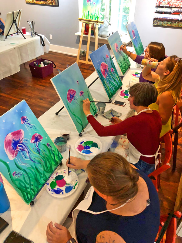
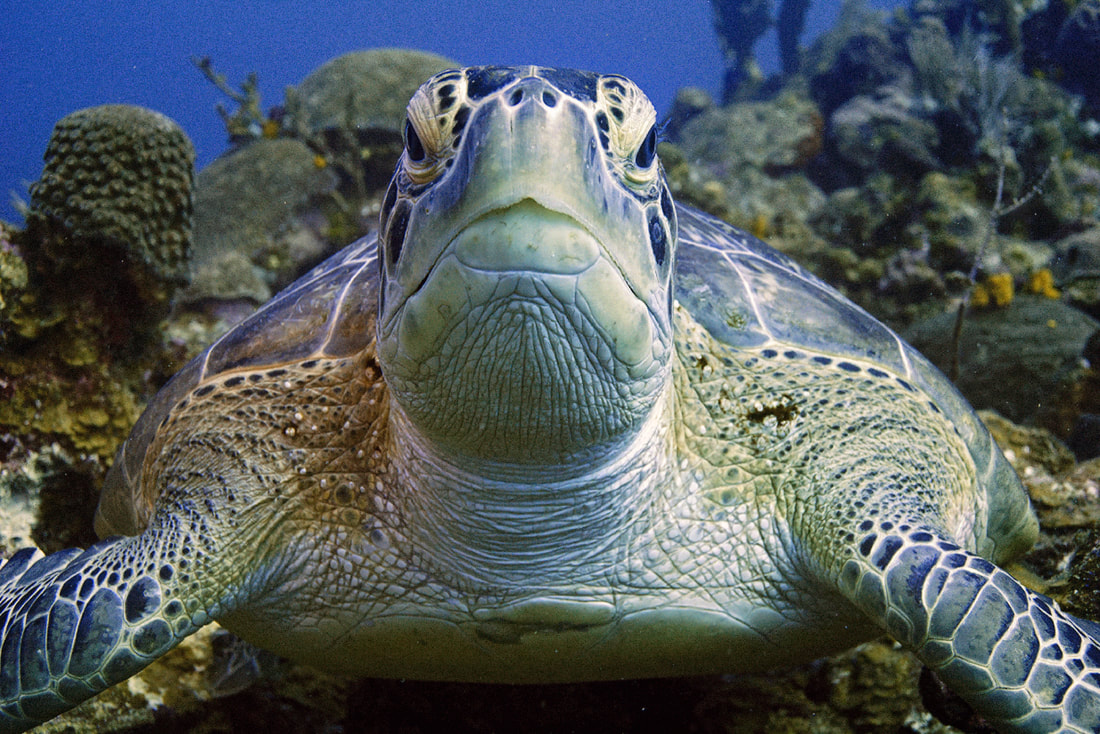
Last Paint Night News: September 22, 2018  Artist Judy Horan provides art for social change in Ontario Canada Judy has been creating art most of her life, through a variety of mediums. ~ INK ~ ACRYLIC ~ WATERCOLOURS ~ PENCIL ~ PHOTOGRAPHY ~ 22 September 2018 It started with a dive trip reunion being planned, spearheaded by Tracey, one of our divers that lives the farthest away from the rest of us, followed by Dawn suggesting a paint night. From there, Annie found Judy, a local artist who was willing to take us all on a paint-night adventure, and Andrea secured the venue as her friend owns The Patrick House Art Gallery in Aurora. 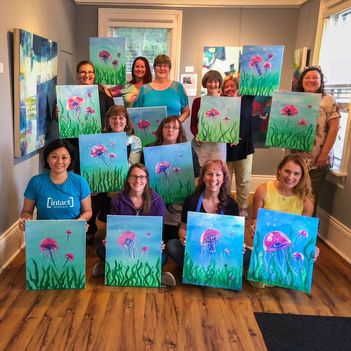 We are all proud of our creations! We are all proud of our creations! We had such a wonderful time, and make no mistake, not a one of us is a professional artist! And it t didn't matter. Our subject matter on September 22, 2018, was a colourful jellyfish. Now we have a million ideas for underwater art that we would like to try our hands at! Whale shark? Yes! Fill out our super, duper short survery below if you are interested in us organizing another paint night featuring an underwater theme (where we long to be). Want to sign up for our scuba newsletter, so you will know when events like this come up? Click and sign up! More photos from our September 22 2018 Painting Adventure:  The original image straight from the camera The original image straight from the camera - In our ORIGINAL jpg image (above) straight from the camera, we have a green sea turtle who is looking rather green. I don't think he has eaten a bad jellyfish, but rather, there is a bit of a green/cyan colour cast that is typical of underwater photography. Most photo editing software applications can handle this with ease. We do want to watch the colour of the water, and of the yellow sponges in the background as we adjust, to try and keep the colours true to life. So here it is, the colour corrections of this turtle from multiple photographers/editors. I love how we get to experience the different feeling and mood of the same image, depending on the photographer's interpretation. Not only that, but we get an introduction to the different types of colour correcting software available out there, and many may find that very useful! If you have questions about the software someone used, please go ahead and leave a question in the comments - we can forward your question, or the photographer can answer it right there! Enjoy! 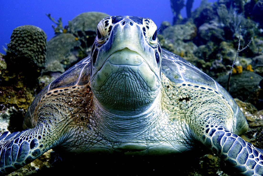 Alex S. - Vivid Pix - Changed the light balance, took some of the depth out of the picture adding some of the colours back into the picture creating a more vivid image. Software used: Vividpix The punchy detail looks amazing, and the water is still blue, and that is the pitfall in this type of image! Next to Alex's edit, the original looks incredibly flat! He's beauty, nice edit! 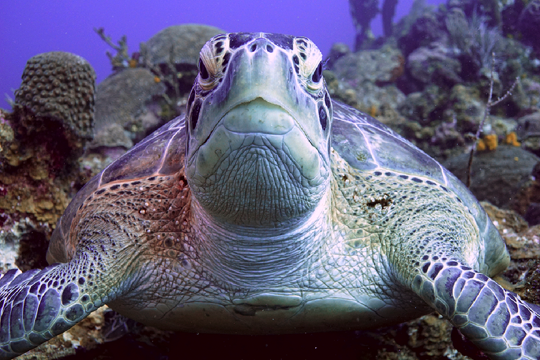 Dan P. - Gimp photo software - Removed the green colours and increased contrast. Software used: Gimp The contrast is better, and the green cast has been removed from the turtle, but this is the hard part: removing the green cast without turning the water pink! The complementary colour to green is magenta, so introducing it into the image does effectively knock out that green, but at the expense of turning the water magenta! If there are HSL sliders or selective colour functions in Gimp, that might be a place to target the blue/pink water separately, without turning the turtle green again. Good work! 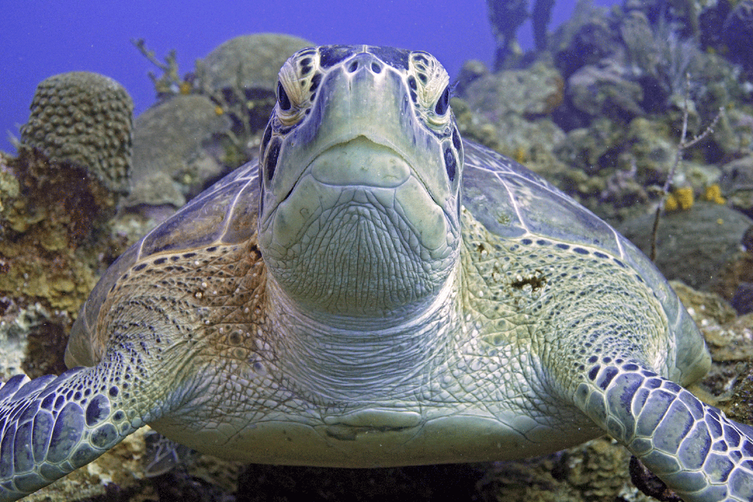 Mike M. - Adobe Photoshop - Worked from JPG. Mainly just adjusted the levels of each RGB channel and did some shadow/highlight changes. Software used: Adobe Photoshop I like the warmth of the colours in the turtle's shell and skin, very nice. The green cast has been addressed successfully, although there is a little bit of magenta creeping into the water behind the turtle. Selective colour (Image > adjustments > Selective Colour) can touch up the blue a bit, or the Hue Saturation box can be used to just target the blues. Looks great - nice edit! 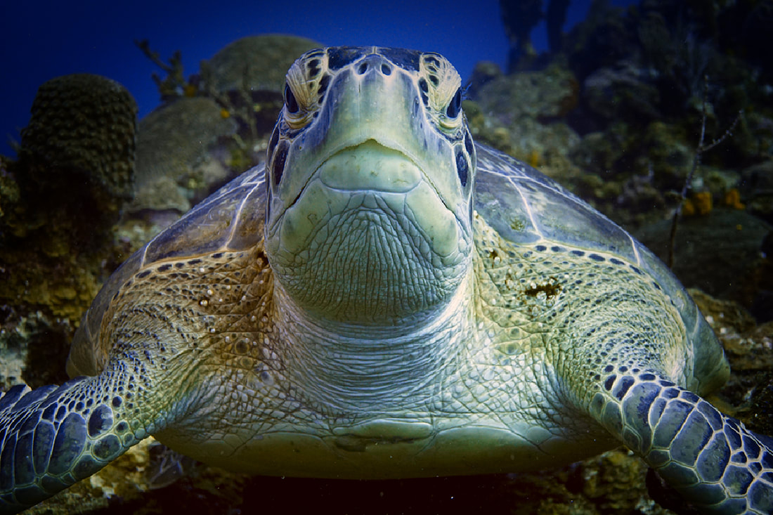 Emma F - ACDsee - used reds and yellows for turtle and layers to create a soft dark frame. Software used: ACDSee Well, the green cast is gone, and though at first glance it seems rather dark, I find it interesting. Nice work! 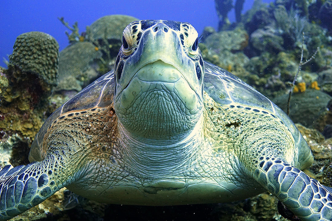 Ian G. - Latest Paint Shop Pro - From the .jpg, I added 9% red, took out 9% green and 15% blue, gamma corrected to -0.80, added 20% saturation, and added a bit of a sharpness filter. Software used: ACDsee from RAW file I like the warmth of the turtle, though there seems to be a bit of grain introduced (creative effect)? The warm detail has been preserved on the right side of his face (his left) over the eye, where it tends to get lost very quickly in editing. Nice work! 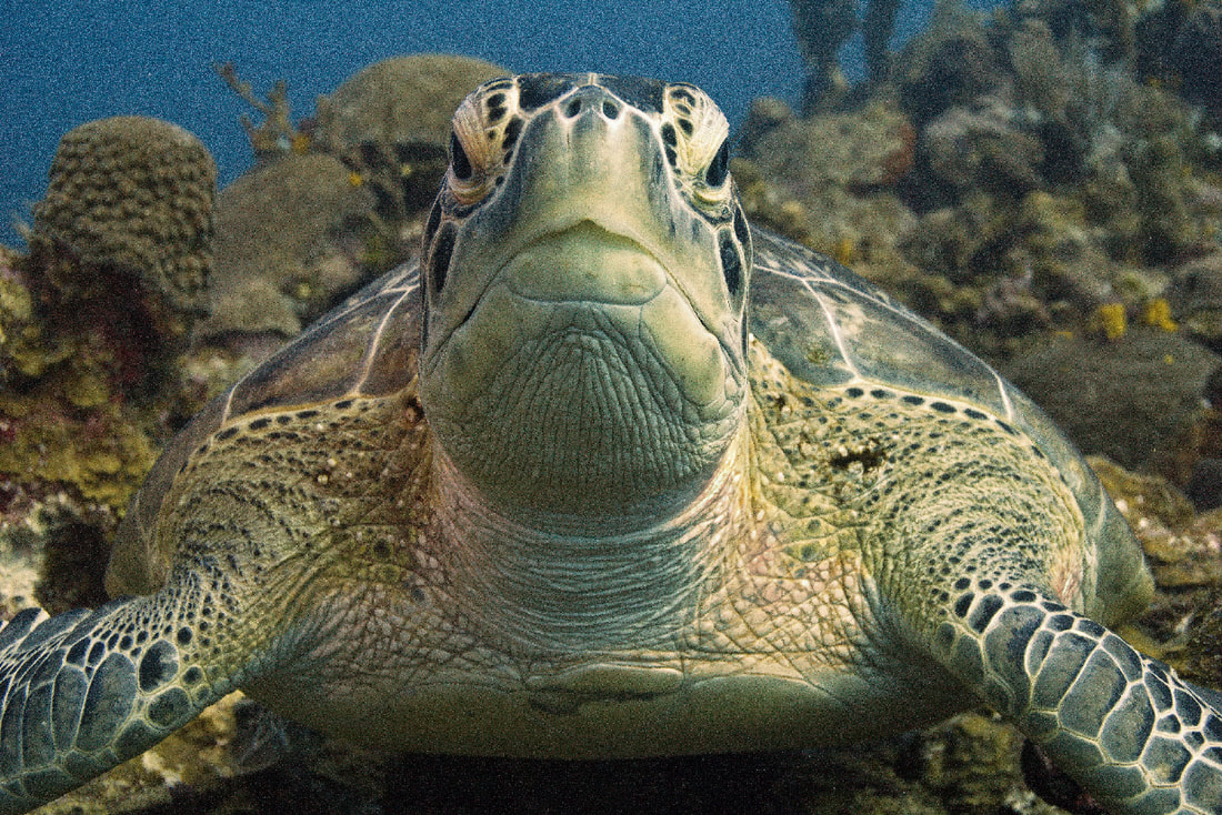 Rick B - ACDsee Pro - Turtle 2.3 - Clearly I have too much time on my hands (lol, Rick) So in total: white balance, dehaze, sharpen, colour adjust shoulder areas, reduced overall blues/violet/mauves, removed speckling below and beside turtle and removed the random twig from right side (of picture) behind turtle Software used: ACDsee from RAW file I like the warmth of the turtle, though there seems to be a bit of grain introduced (creative effect)? The warm detail has been preserved on the right side of his face (his left) over the eye, where it tends to get lost very quickly in editing. Nice work! It's fascinating how different every one of these corrected images look, and I have always found that I learned a lot from these exercises in class, noting the techniques I wanted to employ next time, and pitfalls I knew I needed to avoid in order to achieve what I wanted. Colours, vignettes, detail, and saturation variations can all contribute to mood, so when you have many editors working on the same file, you never know what you are going to get. Thank-you to everyone who participated in our experiment. If you are interested in trying another one, drop us a comment below!
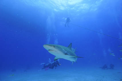
 This is the photo we are going to fix (can be downloaded at the bottom of this blog). To find out how our challenge will work, read on... This is the photo we are going to fix (can be downloaded at the bottom of this blog). To find out how our challenge will work, read on... When photographers post-process their underwater photos, you might be surprised to find that there is a lot of room for artistic interpretation. A photo I colour correct today might look completely different from the same one I already processed last month. Variations in the “look” of a processed photo between different photographers are even wider. There is always room for some artistic expression without actually making any changes to the content of the picture. ...and when you like what another editor/photographer has done to a photo, you can ask them what they did in the comments section - we can learn from each other! Colour Correcting Tip "When the human observer focuses on a subject, it is more colourful, vibrant, and has more contrast than the rest of the scene, meaning everything in the periphery is a little less colourful, and flatter. The camera makes no such distinction, so some photos may benefit from some subtle adjustments mimicking the nature of human vision in order to highlight the subject. Or not. Whatever – you are the artist." Below illustrates the potential for different types of processing, and each conveys a different mood. You decide how colourful or saturated your image is going to be, and how harshly will the detail be sharpened? How much contrast do you need to convey a feeling? Everyone has their own style and preference. Sometimes mine changes from day to day! 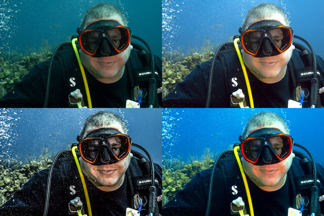 The Proposed Challenge Here’s how it works. I have posted a file for you to download (at the very end of this post). There is a RAW version, plus the JPEG version from the camera. If your software version cannot support RAW processing, don’t worry, just work from the JPEG – it will be fun to see what you can do! Colour correct the image the way you would fix up one of your own. Save it, and email it to me with a brief note describing the software you used. If you do not want me to use your first name, you should indicate what name I should use when I post your pic, like “Logger-head Larry”, for example. The Rules There aren’t any stinking rules! Well, hardly any – this will be a manifest of your artistic expression, but please maintain the original content. Removing spots and silt are ok, but cloning sharks, or cutting and pasting other image elements are not. Maybe that's a different challenge for another day... 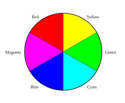 Colour Correcting Tip "Removing a colour cast often means adding the complementary colour in order to neutralize it. For example, if you are at Shanty, and there is a green colour cast, you would add the complementary colour of green, which is magenta - see colour wheel (Naturally, because we KNOW that we lose red as we descend, that is a good place to start!)." The Practice Challenge Results: Below is our "pilot-project" to show you how it will look. I asked a couple of people to help with this experiment to see what would we would get with this file of a shark in the Bahamas, and they graciously accepted the challenge.
Colour Correcting Tip "EVERY TIME you SAVE as JPEG, data is lost, and quality is REDUCED (opening and closing is fine, it's the SAVE function that runs the compression algorithm). When editing photos, save a COPY of your original (you always want to keep your original) as a TIFF lossless file, and edit that." ...THE SUBMISSIONS: 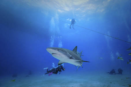 Christian C. Photoshop - working from the JPEG file Water maintained its blue colour, and the green cast in the shark has been eliminated. Some colour and contrast has even been added to the divers in the background! Vignetting adds some depth. 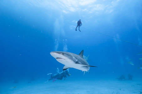 Bob B. Lightroom - working from RAW Water is a little more cyan, which is acceptable for the colour of water (pink and magenta is not), and the green cast in the shark has been eliminated. Shark has been brightened up. 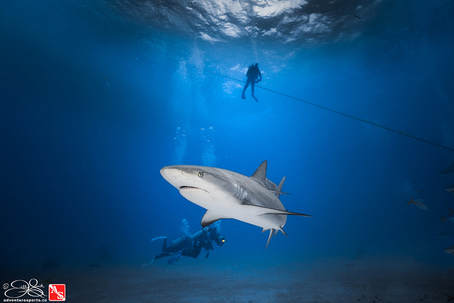 Jill Lightroom - working from RAW A bit darker, vignetting added. Colour cast removed from shark, and HSL sliders used to remove the pinky magenta from the water (aqua and blue hue adjusted). Shark was selected with adjustment brush to make edits selectively on her. Colour Correct Challenge CCC#01 (the RAW files created by my Sony A6000 camera are called .arw) Use either one:
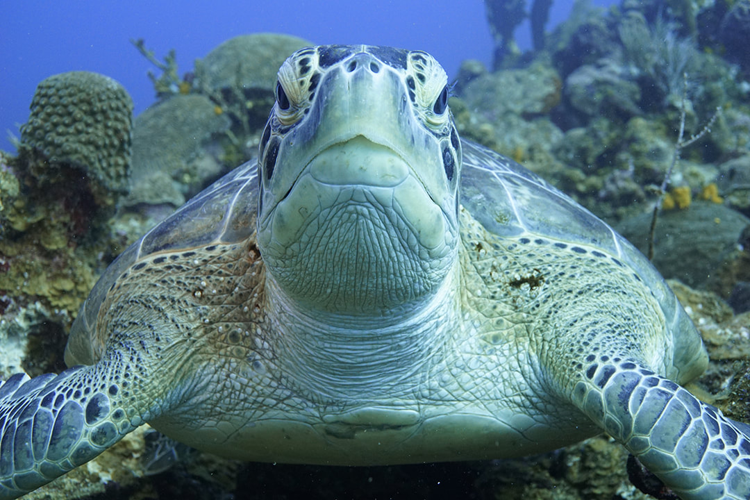 Our green sea turtle friend has an ugly greenish-cyan cast that must be corrected! Maybe parts of him could do with some sharpening too - have fun! Deadline for the Colour Correction Challenge: JUNE 16, 2018
Email your result with Name (or alias) to go with picture, software used, and a brief description of what you did, to: adventuresportsnewmarket@gmail.com Results will be posted in the following blog, and in our July newsletter! Should be fun! |
 FlickrAlbumAuthorsJill Smith 
Coral Restoration
Archives
January 2024
Categories
All
 
|
||||||||||||||||


 RSS Feed
Our Services |
Company |
SupportOur Blog
|
|
Copyright © 2014
|
Newmarket, ON
|
(905) 898 5338
|
info@adventuresports.ca
|